Global Sustainability Challenge
Creating a shared identity for a global sustainability initiative designed to bring together universities, students, and partners around collaborative action. From brand strategy and visual identity to event collateral and communication systems, the project focused on translating an ambitious vision into a scalable and enduring brand capable of growing across institutions, cultures, and geographies.
Overview
How do you create a shared identity for a global sustainability initiative whose success depends on collaboration across cultures, institutions, and generations?
The Global Sustainability Challenge (GSC) presented an opportunity to answer that question.
Led by the Stanford Doerr School of Sustainability, GSC was created to empower students worldwide to engage with sustainability challenges through innovation, collaboration, and long-term action. My role was to develop the initiative’s first visual identity and communication system—creating a foundation that could scale across universities, regions, and future editions of the challenge.
Rather than designing a logo alone, the project focused on creating a coherent identity that could help diverse participants see themselves as part of a shared global effort.
Context
When the project began, the initiative was still taking shape.
The core concept existed: a sustainability challenge that would bring together universities and youth-serving organizations from around the world. Unlike many existing competitions, however, GSC was designed around collaboration rather than rivalry. Its goal was not simply to identify winning ideas, but to foster long-term networks, shared learning, and collective impact.
What was missing was a way to communicate that vision clearly and consistently.
There was no established visual language, no brand framework, and no shared understanding of how the initiative should present itself to students, institutional partners, sponsors, and other stakeholders. The challenge was as much strategic as it was visual.
Challenge
Designing for a global audience introduces a unique set of complexities.
The identity needed to feel credible to universities and institutional partners while remaining approachable and inspiring for students. It needed to communicate sustainability without relying on familiar clichés. Most importantly, it needed to support an initiative built around collaboration, inclusivity, and long-term systems change.
Because the project was still evolving, many foundational questions also remained open:
- Who were the primary audiences?
- How should the initiative position itself relative to other global challenges?
- What values should guide the visual language?
- How could the identity remain relevant and adaptable as the initiative expanded?
The challenge was not simply to create visual assets, but to create clarity.
Approach
I began by treating the project as a communication and strategy challenge rather than a branding exercise.
Through stakeholder surveys, conversations, and research, I worked to understand how different audiences perceived the initiative, what values they associated with sustainability, and what differentiated GSC from similar programs.
One insight quickly emerged: the most distinctive aspect of GSC was its emphasis on collaboration over competition.
That insight became the foundation for the identity system.
Rather than focusing on breakthrough moments or individual achievement, I explored concepts that represented collective progress, shared responsibility, and long-term commitment. This process eventually led to the development of the “Stepping Stones” concept—a visual and narrative framework that would shape the entire identity system.
Process
Research and Alignment
The project began with stakeholder research involving university representatives, project stakeholders, and student participants.
These conversations helped clarify the initiative’s core values and establish a shared understanding of its purpose. Themes such as inclusivity, accessibility, optimism, collaboration, and action emerged repeatedly and became guiding principles throughout the design process.
Developing the Concept
Multiple directions were explored through mood boards, visual studies, and concept development.
The selected concept, “Stepping Stones,” framed sustainability as a journey rather than a destination. The metaphor reflected the idea that meaningful change happens through many intentional actions taken over time, with each participant contributing to a larger collective path.
This concept offered a visual language that felt both globally relatable and deeply aligned with the initiative’s mission.
Building the System
Once the direction was established, I developed a comprehensive identity system that included:
- Logo and lockup system
- Typography framework
- Color system
- Brand guidelines
- Event collateral
- Stage and environmental graphics
- Presentation templates
- Social media assets
- Merchandise applications
- Website direction and supporting assets
The focus throughout was on creating a system that could remain consistent while also being flexible enough for future collaborators, institutions, and organizers to adopt and extend.
Key Decisions
One of the most important decisions was choosing a metaphor that could transcend geography, language, and institutional context.
The Stepping Stones concept represented progress, participation, and collective momentum. Unlike symbols centered on achievement or competition, it emphasized movement and contribution. It suggested that sustainability is not achieved through a single breakthrough, but through many people taking meaningful steps together.
Another key decision was to prioritize scalability from the outset.
Because the challenge was intended to grow internationally, every component of the system needed to be adaptable across formats, audiences, and future editions. Documentation, consistency, and ease of use became just as important as aesthetics.
Outcome
The final deliverable was a comprehensive brand and communication system that established the first visual identity for the Global Sustainability Challenge.
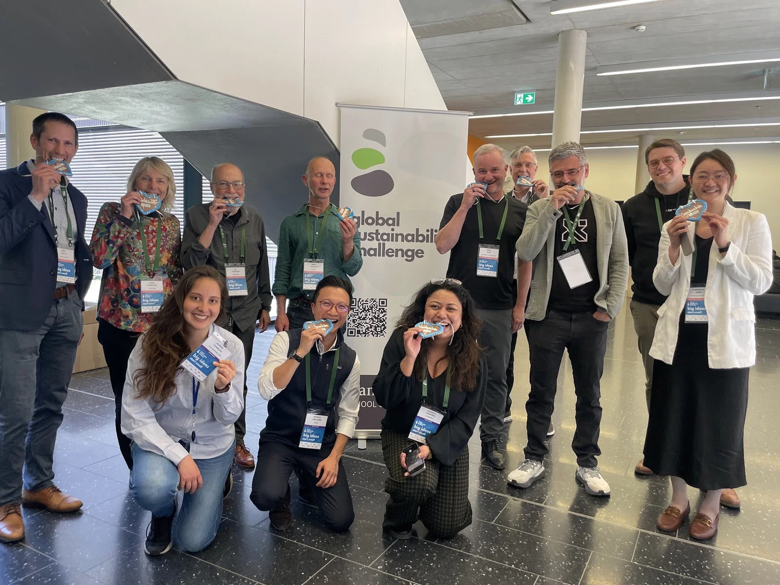
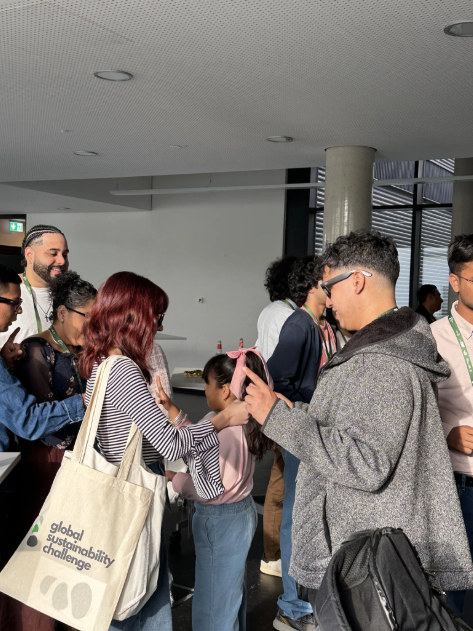
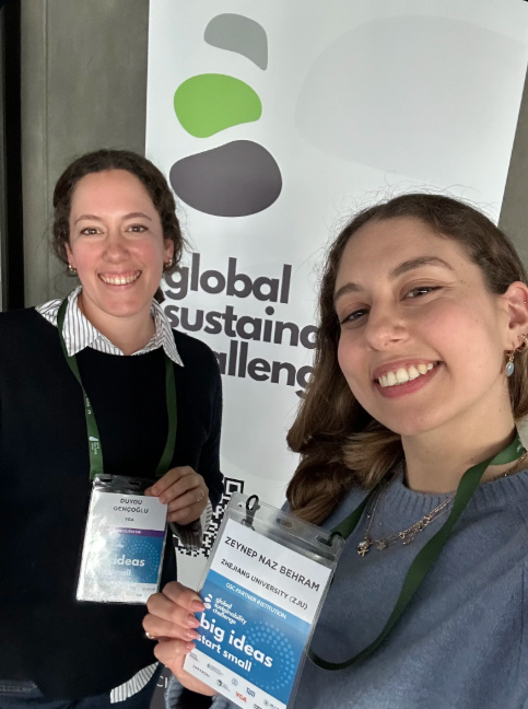
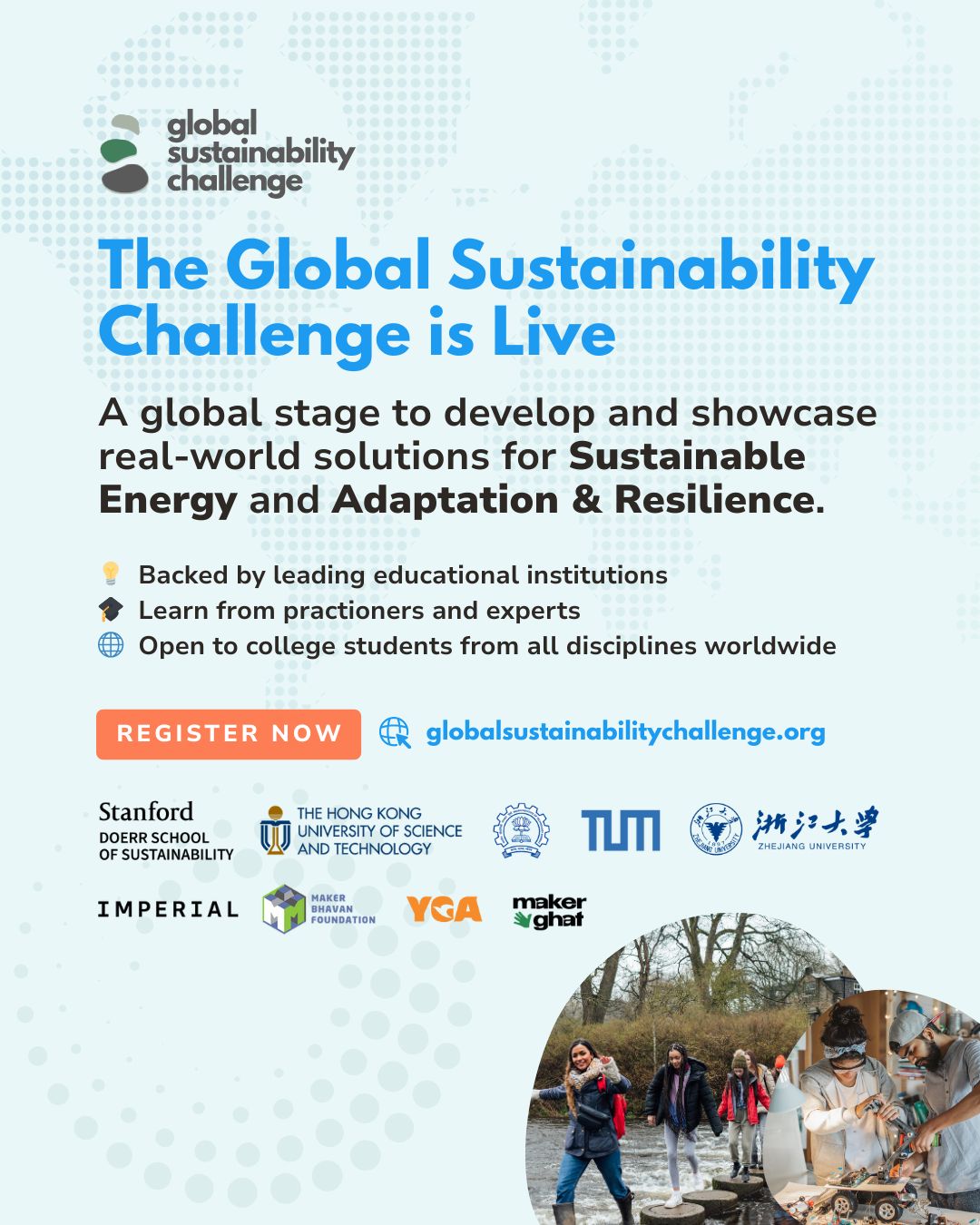
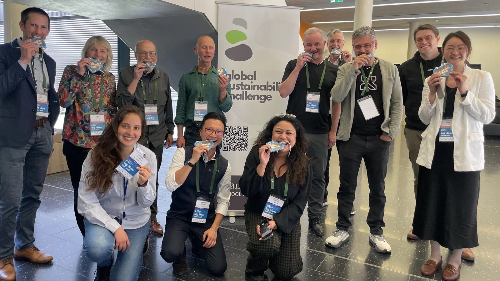
The identity was adopted across regional and global events and applied to a wide range of communications and experiences, including event environments, presentations, digital content, merchandise, and promotional materials.
A particularly memorable moment came during the presentation of the identity to global stakeholders. What began as a series of concepts and conversations had evolved into a shared system that stakeholders could collectively support and champion.
Later, seeing the identity appear across international events—including the global finale in Munich—provided a tangible reminder of how design can help bring a vision to life at scale.
The identity continues to support the challenge as it evolves through future editions.
Reflection
This project reinforced a lesson that continues to shape my approach to design: the most effective identities are not built around aesthetics alone. They are built around ideas.
The success of the project came not from creating a logo, but from creating a story that people could understand and participate in.
The Stepping Stones concept worked because it translated a complex ambition into a simple and relatable narrative. It gave stakeholders, students, and partners a shared language for understanding what the initiative stood for and how they could contribute to it.
More broadly, the project strengthened my belief that design can play a meaningful role in systems change—not by providing answers, but by helping people see themselves as part of a larger journey.
Project Gallery